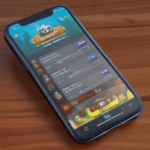
What Online Apps Can Learn from Clash Royale’s User Interface
Clash Royale from Supercell is widely praised not just for its gameplay but for a UI that feels immediate, responsive, and rewarding. As other popular apps—including online casino platforms—look to refine their own experiences, there are clear lessons to borrow from Clash Royale’s design philosophy about clarity, feedback, and progression.
A clean, focused home as the starting point
Clash Royale opens to a simple, purpose-driven hub. A prominent main action—like the Battle button—alongside clearly visible rewards and a bottom navigation bar keeps users oriented from the moment they launch the app. In contrast, many online casino apps flood the initial screen with promotions, featured games, and tournaments, which can overwhelm new and returning players alike. The takeaway is to prioritize a central hub that foregrounds the primary activity (finding and playing a preferred game) and to tuck secondary information into intuitive menus so the first impression is welcoming and efficient.
Making rewards feel tangible and exciting
Clash Royale’s reward loop is brilliantly tangible. Winning a match yields a chest with a visible timer, and the opening sequence—complete with visuals and audio cues—creates a strong sense of anticipation and accomplishment. In many online casino apps, loyalty systems exist in the form of points or tiers, but they can feel abstract. Visual, event-based rewards—such as chests, prize wheels, or progress-driven bonuses—pair-n with satisfying animations to deliver a sense of real progression and excitement, beyond simple point totals or badges.
Visual progression that tells a personal journey
The game uses a Trophy Road and Arena system to map progression, making players aware of milestones, upcoming rewards, and new areas to unlock. This creates ongoing momentum and a clear sense of forward motion. Casino apps often rely on tier labels and benefit descriptions without a vivid visual story connecting each step. Adopting a more graphical progression path—milestones, unlocks tied to visible goals, and new environments—can transform a series of sessions into a coherent personal journey.
Navigation that respects the user’s time
Clash Royale excels in streamlined navigation: essential sections like card collections, shop, and social features are always a tap away, with minimal submenus. Some casino apps, by contrast, require scrolling through long lists or applying multiple filters to locate a specific game, which can frustrate users who just want to play. The principle is simple: group games into clear, intuitive categories, label sections clearly, and ensure major features are reachable with a single tap from the home screen.
Market context and opportunities
The online gaming market remains a potent space for growth. By mid-2025, projections point to a market size well into the hundreds of billions for online table games and slots, underscoring how important user experience is as a differentiator in a crowded field.
A positive, actionable outlook
If online casino apps adopt Clash Royale’s design sensibilities—clean entry points, tangible reward mechanisms, a visual progression narrative, and friction-free navigation—they can improve engagement, satisfaction, and retention while keeping the experience accessible and enjoyable for a broad audience. Approaching UX with a sense of playfulness and clarity can turn daily sessions into meaningful, anticipated experiences.
Additional insights and practical recommendations
– Implement tangible rewards: replace or augment point totals with visual rewards (chests, wheels, or timed bonuses) that unlock meaningful benefits after visible progress.
– Build a visual progression map: design a journey that clearly shows milestones, upcoming rewards, and new features or games that become available at each step.
– Simplify discovery: curate a few well-defined game categories and use prominent, easily discoverable paths to popular titles, reducing friction to start playing.
– Prioritize accessibility and inclusivity: ensure readable typography, color contrast, and screen-reader compatibility; provide adjustable UI scale and reachable touch targets.
– Emphasize responsible gaming: integrate clear time-management tools, gentle reminders, and easy access to help resources to support healthy play habits.
– Measure what matters: track engagement metrics tied to the hub design (time-to-first-play, average sessions per day, and drop-off rates on the home screen) alongside traditional retention and monetization metrics.
Inspiration with care
The core idea is to borrow Clash Royale’s clarity, rewarding feedback loops, and sense of a personal journey while adapting to the distinctive needs and responsibilities of online gambling apps. When done thoughtfully, a refined UI can enhance user enjoyment, drive meaningful engagement, and support responsible gaming practices.
Note: This rewrite emphasizes UX design lessons drawn from the referenced article and contextual market considerations. If you’d like, I can tailor this into a ready-to-publish WordPress piece with an estimated word count, SEO-friendly headings, and a concise meta description.