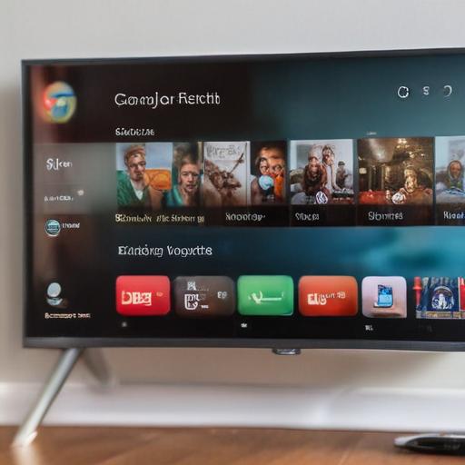
The latest update to the Google TV app has introduced several design enhancements inspired by Material 3 Expressive, which aim to improve the user experience. In this version, details of movies and TV shows now feature a larger banner with a center-aligned header, providing a more visually appealing layout. Additional updates include the transformation of buttons such as Watchlist and Like/Dislike, which have been redesigned to eliminate their circular borders, resulting in a sleeker appearance.
Notably, the Ratings section has also seen a shift, with its shortcuts adopting a pill-shaped format instead of rounded rectangles. Image previews in the Top Stories section now exhibit rounded corners, contributing to a modernized aesthetic. Additionally, the Important Information section has been revamped to present details in a clearer two-column layout.
While these enhancements reflect Google’s ongoing efforts to modernize its apps—previously seen in updates to Google Wallet, Keep, and Gmail—some Material 3 Expressive changes remain absent in this rollout. Future updates could potentially integrate these additional features, promising an even more comprehensive redesign.
User feedback will be valuable as the app continues to evolve. With each iteration, Google aims to create a more engaging and user-friendly interface, which could lead to a more satisfying viewing experience for its users.
