Cracker Barrel responds to backlash with revised logo and noted commitment to core identity
Cracker Barrel Old Country Store issued a statement on Monday after facing widespread backlash over its recent rebranding and new logo. The company said the past few days showed how deeply people care about Cracker Barrel and expressed gratitude for customers’ voices. It also acknowledged that the company could have done a better job sharing who it is and who it will always be.
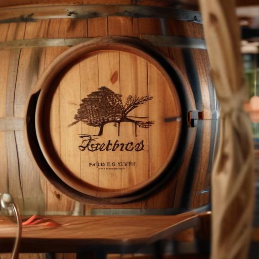
The new logo drops the long-running image of the restaurant’s Uncle Herschel character leaning against a barrel. In its place, the branding centers on the words “Cracker Barrel” set against the outline of a yellow barrel, with the phrase “old country store” no longer featured. The color palette remains close to the original and is said to be inspired by the restaurant’s eggs and biscuits.
What this suggests and what to watch next
– The move signals Cracker Barrel’s attempt to modernize while staying rooted in its traditional identity. By removing the Uncle Herschel figure and the “old country store” tagline, the company is aiming for a streamlined look that still nods to its heritage.
– The acknowledgement of customer feedback indicates a more interactive approach to branding, with an intent to communicate more clearly who the brand is and what it stands for.
– Stakeholders—guests, franchisees, and partners—will likely be watching rollout plans and subsequent messaging to gauge how the brand evolves without losing its nostalgic appeal.
Additional context and value-added notes
– This episode highlights the tension between modernization and tradition in legacy brands. Brands often test new visuals to stay relevant, but customer attachment to iconic mascots and phrases can complicate the rollout.
– If Cracker Barrel continues with this branding, expect phased updates across menus, signage, and digital assets, along with renewed storytelling that reinforces core values: hospitality, homestyle dining, and a sense of Americana.
Summary
Cracker Barrel responded to criticism of its branding by explaining the intention behind the logo change and confirming that the new design emphasizes the name and a simple yellow barrel outline, while removing the Uncle Herschel character and the “old country store” tagline. The company also indicated that its color scheme remains true to its traditional look, inspired by eggs and biscuits, signaling a careful balance between modernization and tradition as it moves forward.
Positive note
There’s a constructive tone in the company’s reply, emphasizing listening to customers and staying true to what the brand represents. If executed thoughtfully, the refreshed visual identity could attract a newer audience while preserving the nostalgia that longtime guests value.
